Signal Gallery, London
11 March – 1 April 2009
all photos: NoLionsInEnglandLondoner Matt Small, nominated for the BP Portrait award in 2001 shortly after graduating from the Royal College of Art, has a compact and colourful joint show with Manchester boy Zac Walsh at Signal Gallery in London.
Matt Small has been a darling of the street art aficionados though if it wasn’t for the urban grime suffusing his work that might be a puzzle as he never works on the streets. Over the past three years Matt has shown extensively in the specialist street art galleries, predominantly Black Rat Press and the late lamented Leonard Street Gallery.
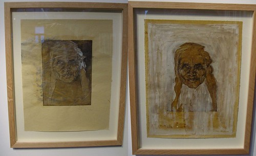
In the previous shows the dominant subject has been the human face. Matt is well known for taking his inspiration from the anonymous citizens who shimmer briefly across his vision and through camera lens before passing on with their lives, usually unaware of their subsequent immortalisation in the distinctive riot of colours which give his portraits contour and expression.

Kaz, found car bonnet, BRP show Mar 09.
Back in 2007 Matt Small gave an amazing demonstration of how he works on flat surfaces, mixing oil based and water based paints then dragging the immiscible colours around the canvas, creating beautiful portrait from the violence and chaos of the squirming liquids.

Leonard Street Gallery live painting, Nov 2007.
The key pieces in this Signal Gallery show are undoubtedly the trio of urban landscapes. Paradoxically for someone so strongly linked to portraiture, these micro communities are actually devoid of human beings though not necessarily lacking humanity.
“These landscapes are from my journeys around town. I find there is something beautiful about these estates. You can walk through them and think they look horrible, you never see anyone but in each house there is a drama going on, there are thousands of lives being lived, there is a lot more than just the outer walls.

London Estate 2, Matt Small
In creating these Matt has used basically the same technique to mix and apply the paints on the metal, the effect is a vibrant colour and windswept motion to the essentially static subject. The pock marked surface of buildings seethes with life reflecting the hidden dramas contained within.

London Estate 3, Matt Small
Whilst London Estates 2 and 3 are essentially 2D paintings, in London Estates 1 Matt has transplanted a meccano styled system of layered laminar deconstruction used in creating some of his 2008/09 3D portraits. This creates a sense of depth and perspective and yet at the same time conveys the kind of down to a budget cheap as chips utilitarian contruction found through-out the 50s and 60s council block estates.

London Estate 1, Matt Small
The canted expanse of grey metal at the bottom of the painting gives a phenomenal depth to the tarmac foreground. The side view below illustrates the complexity of the geometric transformations Matt Small has performed to achieve the incredibly convincing relief effect when view head on

London Estate 1 (detail), Matt Small
At Mutoid Waste’s One Foot in The Grove 2009 show under the Westway, Matt Small took advantage of the bleak blasted concrete walls under the fly-over to preview a completely new style, face portraits created in relief on concrete. There portraits are created using a mould to achieve the basic relief form then cutting lines into the cement surface before it sets.

Concrete Relief Portraits, One Foot In The Grove 2009, Matt Small
The Mutoid editions which were coloured using a simulated tagging (never going to please graffiti writers that one), responding to the space which has legendary status as the UK’s first graffiti hall of fame whilst referencing to the cultural background to the world these kids inhabit. For this show the concrete is sepia toned by the trademark explosion of colour is absent, which seems to emphasize a kind of aboriginal featuring in the portrait which hadn’t really been obvious before.
"I like the surface effect giving the feel of age and texture. I love the idea of materials that you find in the street, cement and metal, it's another way of appropriating what we see in our urban environment"
Unusually, this triptych places the portrait face into a housing estate background.

Jason, Matt Small
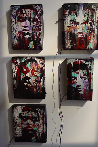
The sense with Matt’s larger shows has been an almost intimidating and overwhelming press of faces, crowding in on you from their car bonnets and dismantled freezer carcasses, so many bodies exerting claustrophobic intimidation that you feel you need an escape. This time the increased variety and quality, inversely related to the reduction in quantity has allowed a fresh appreciation of Matt’s work. With a grand total of 5 pieces in this show Matt demonstrates the broader themes and techniques his work is exploring these days and with these has staked a claim to be one of the (few) truly important artists to come out of the urban art scene.
A Matt Small show couldn't be the complete experience without at least one piece looking like a deranged madman was let loose in at scrapyard with tubes of paint

Darnell, Matt Small
Zac Walsh
Zac Walsh and Matt Small have known eachother since Royal College of Art days in the late 90s and as the friends both work in portraiture it isn’t too wild a leap of imagination to see how a joint show can make sense. Stylistically Zac brings a much cleaner and rich finish to his work. The works were created when Walsh was invited by the Holland Park Opera to attend operas, a new experience and to paint a reaction to the dramas. Zac wasn’t a fan of opera but was inspired by the geniuses creating the opera and the complexity of the narrative and staging.

Francesca Da Rimini, Zac Walsh
In Don Giovani, Walsh reacts to the controversial ending where Don Giovanni gets dragged into hell. The figure at the centre of the painting is the artist and the statue of the Commendatore which drags him to hades comprises stone grey coloured photo collages of Walsh’s own forearms. The circles in the middle of the horns are Dante’s map of hell and the drama is set against the background of a crucifix. A lot of the opera’s symbolism gets onto Walsh’s canvas.

Don Giovanni, Zac Walsh
Whilst the characters depicted come from the opera, Walsh has used close friends as the models giving the artwork a personal relevance as well as a lesson in dealing in people’s egos (“my thighs aren’t that big!”).

La Forza Del Destino Zac Walsh
The pictures combine photo collages with a very saturated colouring in the painting, not to mention the occasional bit of spray paint. A knowledge of opera isn’t essential for the interpretation of Zac’s painting, suffice that the evident richness and classical beauty permits the paintings to stand up to the un-snobbish scrutiny of the non-opera buff.

Fidelio, Zac Walsh

Pelleas And Melisande, Zac Walsh
 D*Face